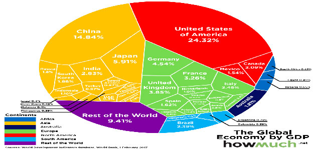
The latest GDP numbers from the World Bank were released earlier this month, and today’s visualization from HowMuch.net breaks them down to show the relative share of the global economy for each country. As Visual Capitalist’s Jeff Desjardins explains, the full circle, known as a Voronoi Diagram, represents the entirety of the $74 trillion global […]

