by Josh Brown at Downtown Josh Brown
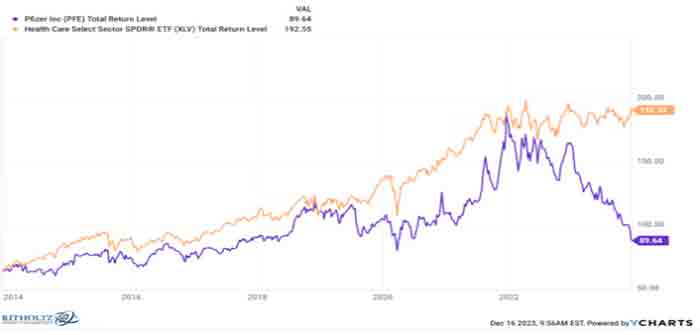
The collapse of Pfizer is well and truly stunning. I think it’s one of the biggest individual stock stories of the year and, perhaps, the very worst one:

The orange line is the S&P 500 Health Care sector ETF and the purple line is Pfizer’s stock price, on a total return basis. This is a ten year chart, which throws a big monkey wrench into the standard “just buy great companies and hold them forever” bit of received wisdom we all hear from an older relative at some point early in our investing careers.
Is Pfizer not a great company? Founded in 1849 in Brooklyn. $100 billion in annual sales. Over 80,000 employees. Treating tens of millions of patients for a thousand illnesses all over the world. If that’s not a “great company” I don’t know what is. And yet, look at that purple line plunge, both in absolute terms but also relative to the sector. You’d have been better off holding Merck (which remained a Dow Jones Industrial Average component in 2020 while Pfizer was being kicked out). You’d have been better off holding just about anything in the large cap pharmaceutical or biotech space.
And, to add insult to injury, Pfizer isn’t even going to be a player in this decade’s hottest class of drugs – the GLP-1 inhibitor weight-loss bonanza. They threw in the towel on that earlier this month…
